Cards
Cards are used to place text, images, and more on the page. They range from basic cards that apply no special formatting to the text on them (leaving the rest of the modification to you) to cards that place images, text, and buttons together in a nice cohesive look.
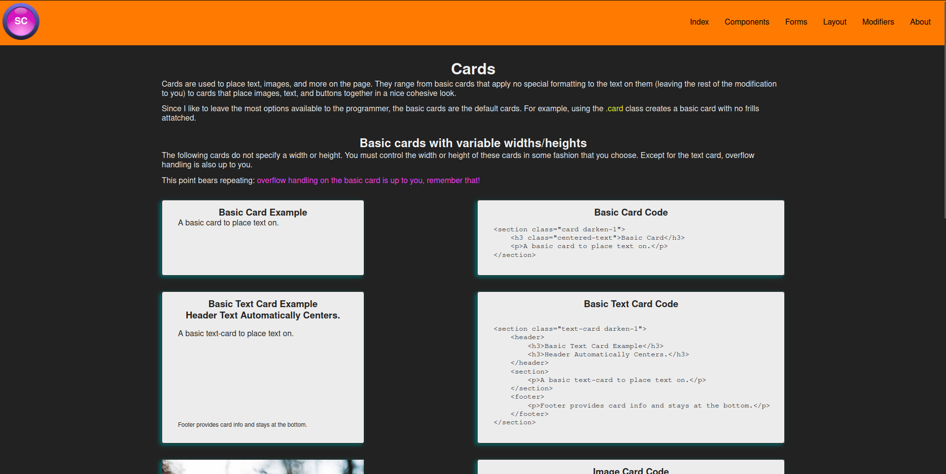
The following cards do not specify a width or height. You must control the width or height of these cards in some fashion that you choose.
Basic Text Card Example
Header Text Automatically Centers.
A basic text-card to place text on.
Basic Text Card Code
<section class="text-card darken-1">
    <header>
        <h3>Basic Text Card Example</h3>
        <h3>Header Automatically Centers.</h3>
    </header>
    <section>
        <p>A basic text-card to place text on.</p>
    </section>
    <footer>
        <p>Footer provides card info and stays at the bottom.</p>
    </footer>
</section>

An example image. Image size is contained to a max width of the card. Height and width will vary based on image size and available space unless you specify a width or height for the card.
Image Card Code
<section class="img-card fh-500">
    <figure>
        <img src="/static/img/styleguide/img-card-example.webp" alt="Styleguide Logo">
    </figure>
    <figcaption>
        <p>An example image. Image size is contained to a max width of the card. Height and width will vary based on image size and available space unless you specify a width or height for the card.</p>
    </figcaption>
</section>
Quote Card
"Your quote goes here."
Quote Card Code
<section class="quote-card darkest-black-text darker-teal-shadow">
    <h2 class="quote-card-title">Quote Card</h2>
    <div class="quote-card-body">
        <blockquote class="quote-card-text text-centered">
            "Your quote goes here."
        </blockquote>
    </div>
    <footer class="quote-card-footer">
        <p class="quote-card-author">- Author Name</p>
        <p class="quote-card-date">Date</p>
    </footer>
</section>
Portfolio Card

Simplicity CSS is a CSS Framework aimed at speeding up website development.
Portfolio Card Code
<section class="portfolio-card darkest-black-text darker-teal-shadow">
    <header class="portfolio-card-header">
        <h2>Portfolio Card</h2>
    </header>
    <div class="portfolio-card-media">
        <img src="/static/img/styleguide/project.png" alt="Project Image" class="portfolio-card-image">
    </div>
    <div class="portfolio-card-description">
        <p>Simplicity CSS is a CSS Framework aimed at speeding up website development.</p>
    </div>
    <a href="/styleguide/" class="portfolio-card-button">
        <button class="accept-button">Learn More</button>
    </a>
</section>

Product Card Code
<section class="product-card darkest-black-text darker-teal-shadow">
    <div class="product-card-image">
      <img src="/static/img/styleguide/tux.png" alt="Product Image">
    </div>
    <div class="product-card-info">
      <h2 class="product-card-title">Product Title</h2>
      <span class="product-card-price">$19.99</span>
      <p class="product-card-description">An adorable tux plushie to keep you warm on the coldest of nights.</p>
      <a class="product-card-link" href="#">
        <button class="accept-button">Purchase Now</button></a>
    </div>
</section>
Content Navigation Card
Content goes here
Content Navigation Card Code
<section class="content-card darker-teal-shadow">
    <header class="content-card-header">
        <h2 class="content-card-title">Content Navigation Card</h2>
    </header>
    <div class="content-card-content">
        <p>Content goes here</p>
    </div>
    <footer class="content-card-footer">
        <div class="content-card-buttons">
            <button class="content-card-btn action-button">Back</button>
            <button class="content-card-btn action-button">Forward</button>
        </div>
        <aside class="content-card-additional-info">
            Additional information goes here
        </aside>
    </footer>
</section>
X
You have mail!
X
Success!
X
Your mail is malformed!
X
Your mail is failing to sync!
X
Notification Cards
Note: The parent element containing these cards should have an id of "notifications" if you are using the simplicity JS framework as well.
<section class="notification-card-info col-start-4 col-end-7 col-start-lg-4 col-end-lg-7 col-start-md-1 col-end-md-13 col-start-sm-1 col-end-sm-13 darker-teal-shadow">
    <p class="notification-text">You have mail!</p>
    <p class="notification-close">X</p>
</section>
<section class="notification-card-success col-start-4 col-end-7 col-start-lg-4 col-end-lg-7 col-start-md-1 col-end-md-13 col-start-sm-1 col-end-sm-13 darker-teal-shadow">
    <p class="notification-text">Success!</p>
    <p class="notification-close">X</p>
</section>
<section class="notification-card-warning col-start-4 col-end-7 col-start-lg-4 col-end-lg-7 col-start-md-1 col-end-md-13 col-start-sm-1 col-end-sm-13 darker-teal-shadow">
    <p class="notification-text">You have mail!</p>
    <p class="notification-close">X</p>
</section>
<section class="notification-card-error col-start-4 col-end-7 col-start-lg-4 col-end-lg-7 col-start-md-1 col-end-md-13 col-start-sm-1 col-end-sm-13 darker-teal-shadow">
    <p class="notification-text">You have mail!</p>
    <p class="notification-close">X</p>
</section>
